
I mostly work with Google Chrome Canary - the pre-view version of Google Chrome. (due to printing issues - don't ask)
Since today, Chrome has shown up with an ugly and bulky new interface. Maybe to make life easier for people who use touch to work with the browser. I don't know. The interface reminded me of Firefox. See for yourself:

This was one of the things which disturbed me, and my workflow. Enough that I did some research and found out how to undo this change, and I want to share it with you.
Open this website:
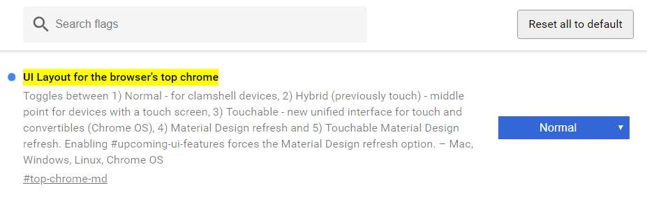
chrome://flags/#top-chrome-md

Select "Normal" from "UI Layout for the browser's top chrome". Click on Relaunch now at the bottom of the screen:

You'll go back to the interface we all know and love:

This interface allows you to open a new tab by clicking to the right side of the open tabs to open a new tab - as God himself intended. Also, it uses less screen estate for the tabs.
Google, please don't remove this interface option. Or make it default on PCs with mouse again. It's the best interface of any browser out there!
P.S: if you want to go back to the ugly interface again, because you like it - select "Default" from the drop down. There are also some other options you can experiment with ( Default / Normal / Hybrid / Auto / Touchable / Refresh / Touchable Refresh )
P.P.S: If you are interested in Raspberry Pi computers / Pi Zero W you've come to the right place. We deal in Pi Zero W & Pi 3 & accessories, and are an approved Raspberry Pi reseller.
1 Kommentar
David
Thank you man, you’re a real hero. I would rather delete chrome than use the new interface.